Close the loop
I’ve been racking up more experience with Claude Code here.

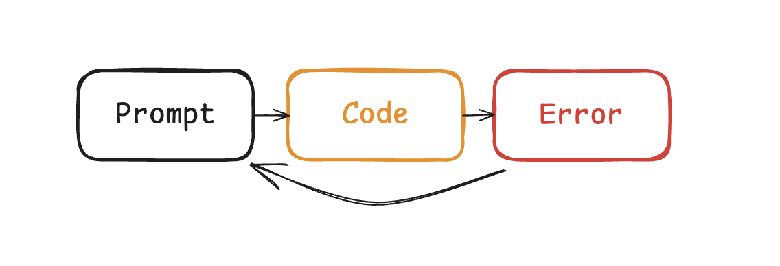
What’s the difference between Claude and Cursor? Claude Code feeds the errors back into the LLM automatically. When I was coding with cursor, I found myself copy-pasting errors all the friggin’ time. But with Claude Code, I had to do it much less frequently. Why? Because it’s able to close the loop on the feedback it gets from failures.
 |
|---|
| Feedback, automated |
This works for code snippets that fit within a small context window, and the code compiles because it has the bash commands to build the thing. But what about the times where it builds, but it doesn’t work? A function that runs but returns the wrong answer isn’t going to trigger any errors.
 |
|---|
| Tests are automations |
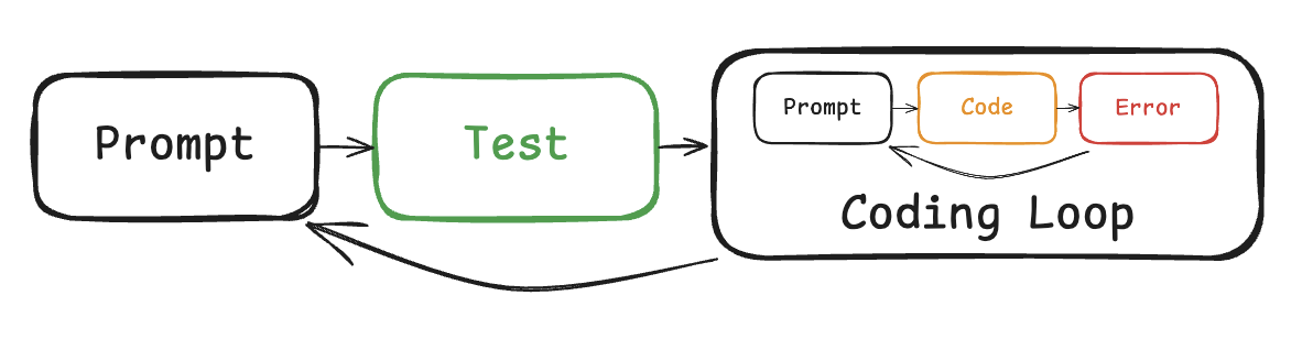
This is why I prompt it to write tests first. Whatever opinion you have about TDD, throw it out the window. It needs reevaluation in the era of agentic coding. By allowing Claude Code to know what to expect, it can get feedback in the terminal, where it can see what’s wrong. At this point, code quality doesn’t matter as long as it’s not a significant hit on performance. If the tests pass, users are happy. I’m happy. Claude Code is happy.
But what if the tests are wrong? It happens all the time, especially with changing requirements. Dependencies change, interfaces shift. What then?
Tests are not a reliable source of truth if it has a symbolic relationship with the code. Users don’t care if it’s written in React or Svelte or jQuery, and neither should I. Tests are subject to change with implementation. What we need is an implementation-agnostic specification.
 |
|---|
| Loop-ception |
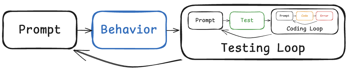
Thankfully, Behavior-driven-development has got that covered. It advocates for intermediate artifacts that bridge the gap between natural language and code. In the agile world, there are tons of these that people love to hate because of how far it is from shipping code to users. Some examples include user stories, use cases, PBIs, story points, etc.
I wouldn’t go as far as to set up little agents that do estimations and move tickets from left to right, but you need to give Claude Code something to check against if you don’t want to repeat yourself. Don’t be that guy that has to tell Claude to “fix it”, “no not like that”, “you don’t make mistakes”. It can’t read your mind.
 |
|---|
| Elicitation |
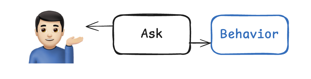
But it can ask you questions. I used to try to describe the whole thing at once, but it was never enough. The better way to write specs is to give a loose description of a vision or goal, and get it to ask questions to fill in the gaps. I like to iteratively plan for two kinds of documents: .features and work_plan.md. These act as guardrails, giving Claude no room to guess what I want.
 |
|---|
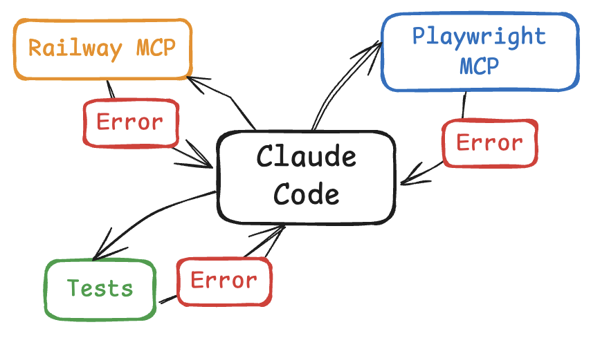
| MCP servers all the loops |
The abstraction of closing the loop goes beyond tests. Just this week, I used Railway MCP to close the loop on devops. It can read the logs on prod and deployments, so I don’t have to copy paste back and forth. Same with Playwright or Puppeteer. It can read the console logs so I don’t have to copy paste. If Claude knows what done means, it will persist.
If you find yourself copy-pasting errors, ask yourself - how do I feed it back into Claude Code?
Stop looking for magic prompts that can one-shot an app in two hours. No such thing exists, and even if it did, the output would be too fragile for modification. With a concrete description of your expectations, it can steer itself to the finish line, and ground itself in truth.
See the arficacts on the Github repo: Vectorspace